Logo Designs

by Drawing Pad | 24 May, 2005 | Blog, graphics

Abingdonlogos
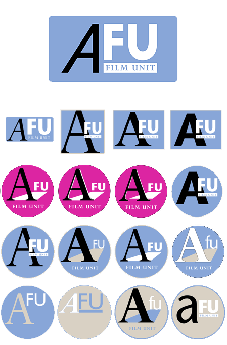
I have been doing a lot of work on the logos above. The brief was for a logo that would help give an identity to the Abingdon Film Unit. Logos for the Crown film Unit and GPO Film Unit as well as Atlantic records were given as suitable examples. In other words we were looking for a classic maybe even retro look. I was keen to use the Abingdon typefaces of Perpetua and Stone Sans. In the end FILM UNIT is in perpetua but the sans serif AFU uses Gills Sans as a basis. Eric Gill designed Perpetua as well Gill Sans. Around school everyone talks about the Film Unit so I wanted to keep the film unit element of the design separate in someway. The chosen and refined design is shown large at the top.

Posts

  • Four Interiors
  • Train Journeys
  • Christmas Walk
  • Paris
  • Travelogue – Series of 4 Paintings
  • New Year: Sketchbook Circle
  • Portraits of Emma
  • Nature vs Art – Visiting London
  • Three Portrait Drawings
  • Small life drawings
  • Keeping it simple – Line Drawing
  • Blue wash – place and mood
  • Drawing on trains (again)
  • Rural and Urban
  • Finding stuff to draw in the everyday
  • Drawing for painting – imagination
  • This Time
  • London Sketches
  • Waiting for a train; sermon notes
  • Scratchy Small Drawings
  • Shading Faces
  • Visiting London – drawing and collage
  • Card Paintings
  • Surrey Roads Drawings
  • Brighton Rocks
  • City Spaces 2
  • Urban Drawings 1
  • City Spaces 1
  • Christmas family drawings
  • Travel Drawing – people everywhere
  • X
  • Instagram